Case study
web design
Web Design & Development: Elly Popova K2U
Sofia, BG
February, 2020
Web Design


Aims & Goals
Website Goals & Client Wants
Main objective was to create a website that presents my client Elly and her services. Elly is an Oriflame associate and its also an online business coach for women who want to start their own business but don’t know how.
1st – position Elly as an authority in the eyes of the website visitors, show her expertise and her services;
2nd – have an integrated platform for scheduling free consultation calls with new potential clients so Elly can close deals one on one;
3rd – have a blog page with different categories integrated in it that can be filtered by keywords at the top;
Pages & Structure
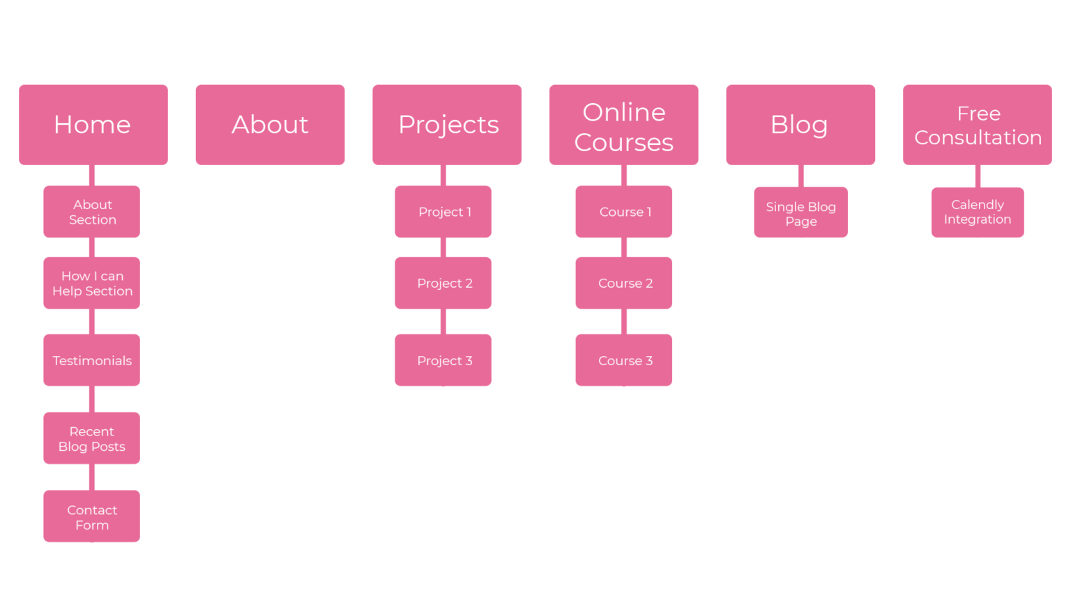
Website Pages Structure
When I do website design, one of the first steps is clearly defining the web page structure. What’s the number of pages and exactly what content are they going to have. From there I can structure each page with the necessary sections & divide the content so that it makes sense.
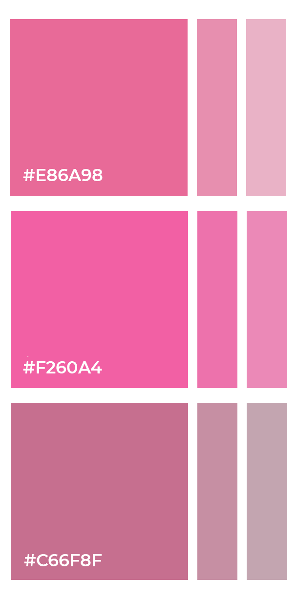
Colors & Fonts
Color Palette & Font Choices
The color selection is manly made of vibrant pinks that are meant to attract the attention of the website visitors. Of course the pink is also responsible for hinting the feminine style and feel of the website – gentle yet assertive, just like business women!
Selecting the font families we are going to use was a challenging task because the client wanted one hand written font and in Bulgarian Cyrillic there wasn’t much of a choice when it comes to hand written fonts. We ended up using the font Celestine as the decorative font choice.
Besides that for the headers and titles we used the Osward font family and for the paragraphs and blog posts we used the Open Sans family.
Design & visuals
Home Page Design
Let’s continue with the actual visuals of the website and how we created the whole website aesthetic around the information of the client that we gathered before the start of the project. This is probably the most fun part for me as a designer – the actual hands on design experience and showing the progress to the client.
*Disclaimer: the person in the pictures is not the client Elly Popova. The pictures are of a YouTube creator

Design & visuals
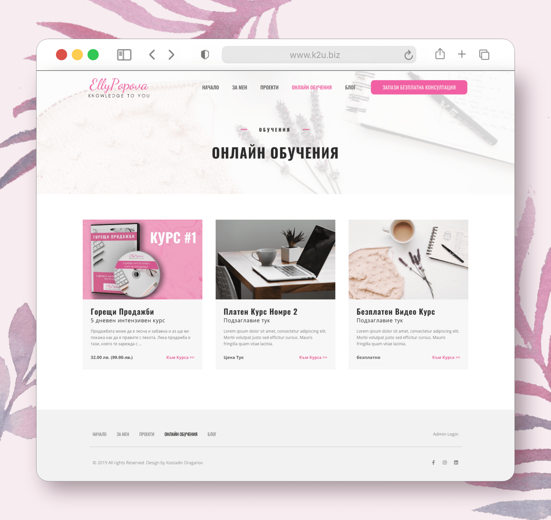
Online Courses Page
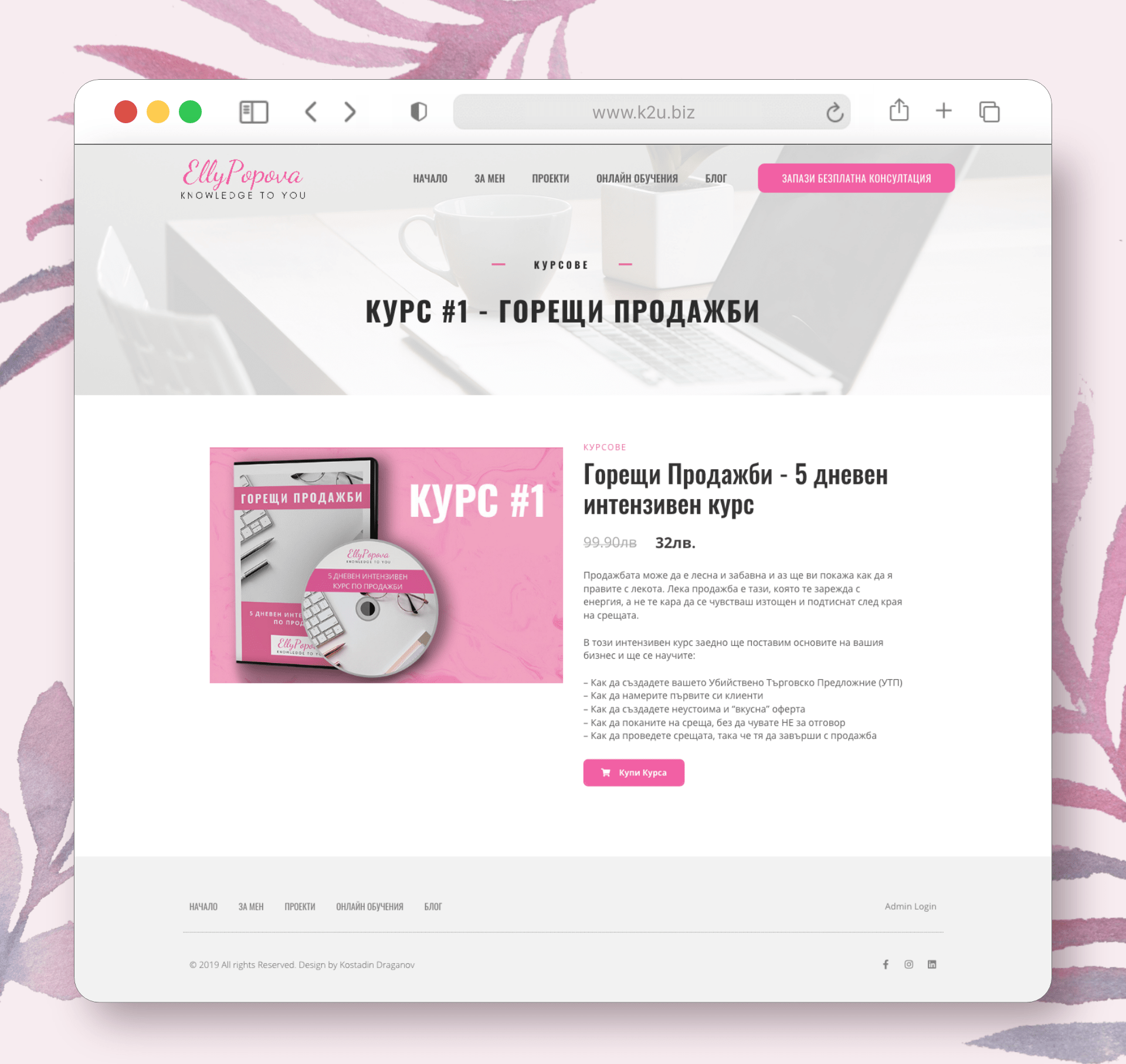
Since the the client wanted to have a page with some paid and some free courses, I created the pages below. Currently the client has only one course and the page isn’t finished because there will be some new information that we are going to add soon.
The checkout happens manually due to the unavailability of possible payment methods for Bulgaria. The current checkout takes the client to a contact form and once they fill it in they are taken to a page with possible payment methods and instructions for EasyPay or Bank Transfer payment.
Design & visuals
Blog Page with Category Filter
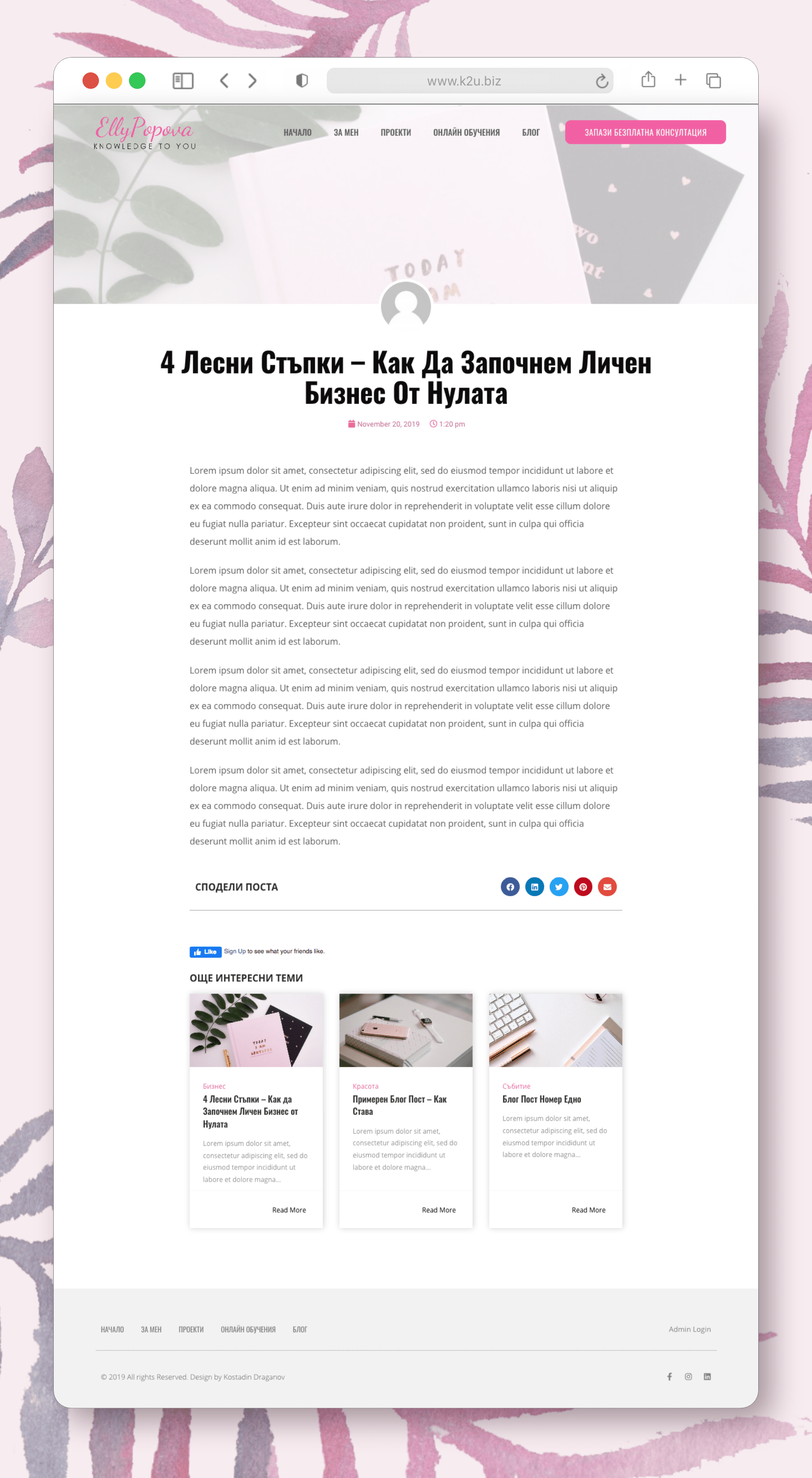
Today a website without a blog is probably only reserved for e-commerce websites that sell ONLY products. Even then they can use a blog page to drive organic traffic with some good Search Engine Optimization. In this case my client is a service based business, so she undoubtedly needed a well functioning and well designed blog page.
My client also had a specific request – to be able to have different blog categories that can be filtered with one click only. She wanted visitors to be able to see all of the categories at a glance on top of the blog section. The single blog page features easy to comment Facebook section as well as quick share social media buttons.
