Aims & Goals
Website Goals & Client Wants
Main objective was to create a website that has an integrated online course system or the so called Learn Management System. Along with that the site is meant to represent my client Milena and her work as a content creator, vlogger and influencer.
1st – integrate the online course system, profile registration/login and configure paid and free courses and how they can be accessed by users;
2nd – present Milena and her work, show her previous brand deals and position her as one of the top Bulgarian influencers;
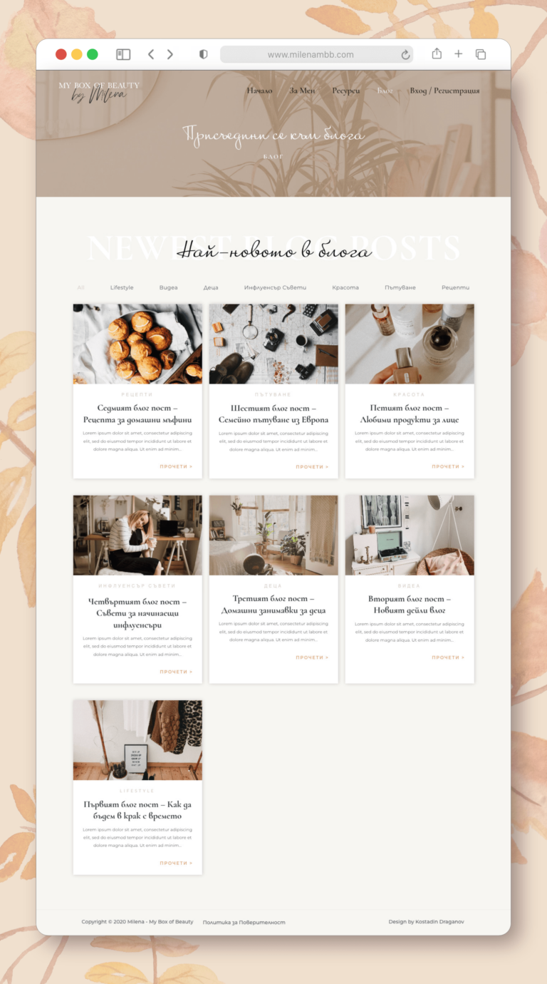
3rd – have a blog page with different categories integrated in it that can be filtered by keywords at the top;
Pages & Structure
Website Pages Structure
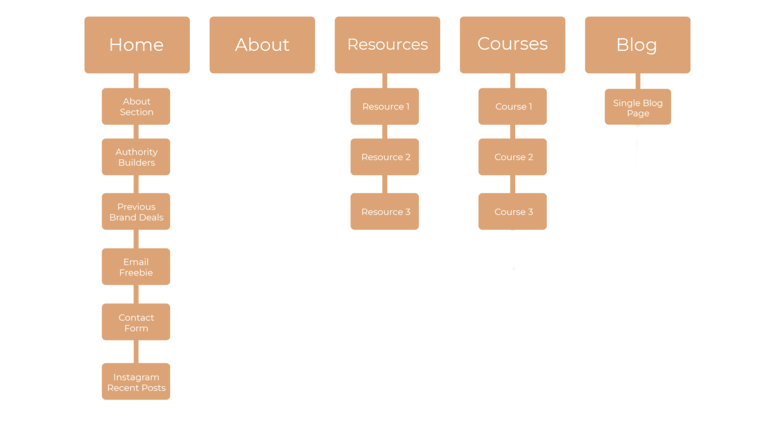
When I do website design, one of the first steps is clearly defining the web page structure. What’s the number of pages and exactly what content are they going to have. From there I can structure each page with the necessary sections & divide the content so that it makes sense.
Colors & Fonts
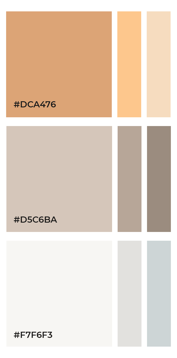
Color Palette & Font Choices
The color selection is made of warm beige colors & some sand tones. The color palette is what Milena uses for her Instagram pictures. Her picture filters are mainly warm autumn tones and that’s why we wanted the website tones to connect to her initial picture style.
Selecting the font families was a once again a bit of a challenge because the client wanted one hand written font and in Bulgarian Cyrillic there isn’t much of a choice when it comes to hand written fonts. We ended up using the font Inspiration as the decorative font choice.
Besides that for the headers and titles we used the Cormorant font family and for the paragraphs and blog posts we used the Montserrat family.
Design & visuals
Home Page Design
Let’s continue with the actual visuals of the website and how we created the whole website aesthetic around the information of the client that we gathered before the start of the project. This is probably the most fun part for me as a designer – the actual hands on design experience and showing the progress to the client.
A specific feature that Milena wanted was an Instagram feed that send the users to her profile. That’s what we implemented at the bottom of the home page and also some other pages.

Design & visuals
Online Courses Platform
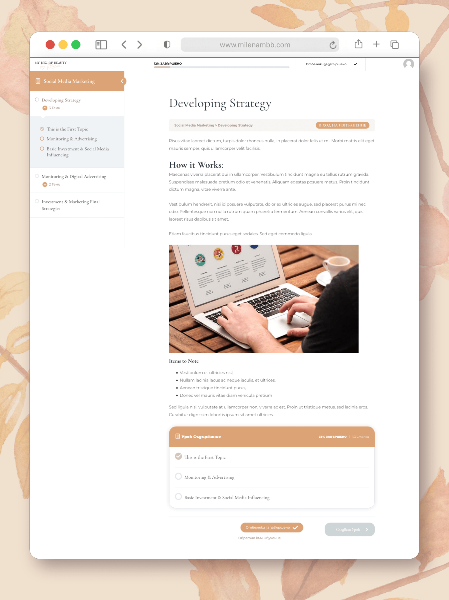
The main goal of this website was to be able to host online courses. Primarily video based but also other materials such as text & pictures. In order for users to access the free or paid courses they have to register first. This way they have their own account & Milena can collect their emails for a later marketing stage.
Each user has its own little profile on which they can see what courses they have signed for. The course page shown below has the topics and modules on the left and the content on the right.
Design & visuals
Blog Page with Category Filter
In this case Milena obviously wanted a blog inside her new website. She has been a video blogger on YouTube for more than 7 years. Meanwhile she always wanted to have a written blog where she could repurpose her content in one more way.
She also wanted to have different blog categories that can be filtered. She wanted visitors to be able to see all of the categories at a glance on top of the blog section.
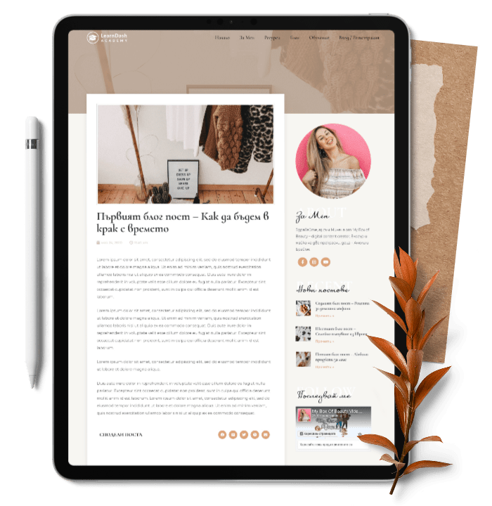
On the right of the single blog page she wanted to have an integrated quick access YouTube section with some of her recent videos. The single blog page also features easy to comment Facebook section as well as quick share social media buttons.
Design & visuals
Freebie Pages
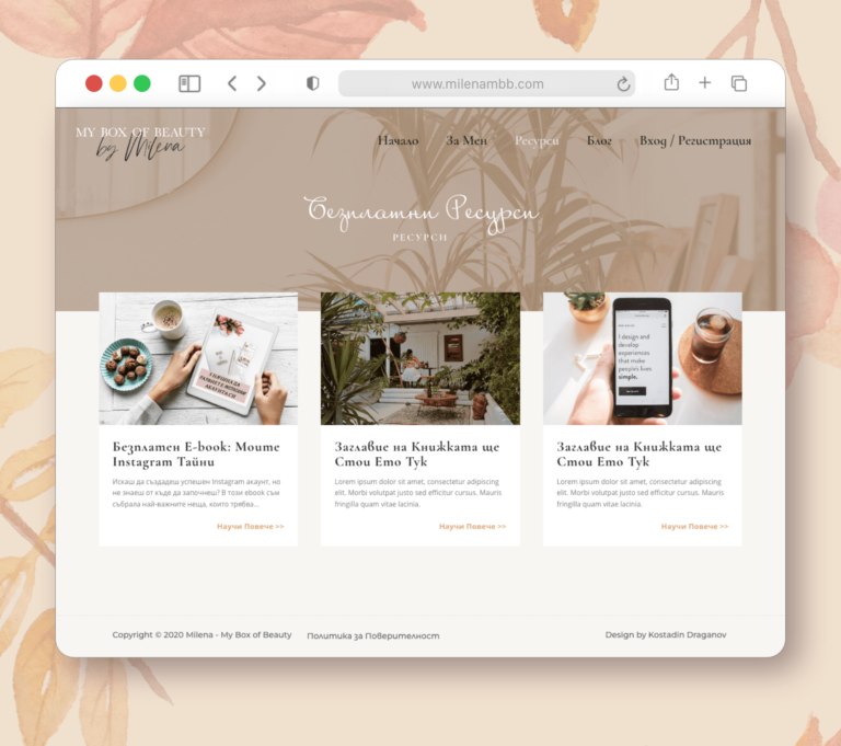
Of course we had to add a page with freebies and free resources in order to collect more emails for Milena’s list. She already had one ready resource that we could upload. In the future she can add more resources and freebies as she goes. For now we only have one ready for download freebie. The download form is integrated with the MailChimp list that Milena has and automatically adds the names & emails once people fill in the form.
The Testimonial

