Case study
graphic design
Astrology Magazine
Stargazing is a magazine about astrology and its basics. Since astrology really interests me I decided it would be a perfect topic for me to start and make my first editorial work, explain the basics of it and combine it with visually pleasing pictures and fonts.
Munich, DE
February, 2018
Editorial Design
Aims & Goals
Goal of the Project
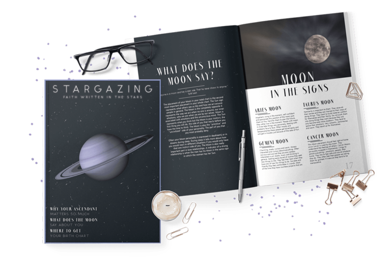
My first job was to decide what information goes into it, main colors and shapes that I was going to use and where I was going to get the high quality pictures. I wanted it to be dark themed with a pop of purple and be as simplistic and basic as possible so the reader can focus on the information & the beautiful pictures.
Some helpful questions I asked myself before starting:
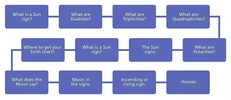
Q: What information will go inside the magazine?
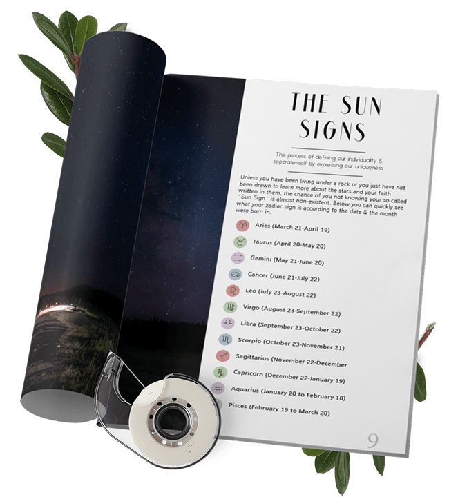
Basic information about astrology and how and where you can create your birth chart.
Q: What colors will suit the topic?
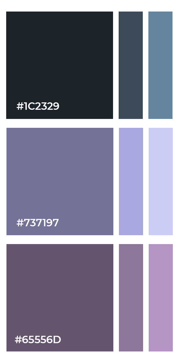
Dark blues, light purples, white and graphite black for the text.
Q: What shapes will suit the topic?
A: Circles like the planets & straight ordinary shapes.
CONTENT STRUCTURE
Structuring the Information
The selection of information was not an easy task because astrology is a such a huge topic to talk about and there is a lot of information out there. I had to choose the basics so the magazine doesn’t become a book. In the end it worked out pretty okay because it’s targeted towards beginners who want to start exploring astrology.
Colors & FONTS
Color Palette & Typography
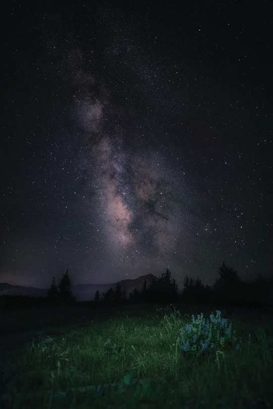
The whole aesthetic is connected to the mysterious universe & its deeper, darker tones. Playing a huge role in the design of the magazine are the carefully selected pictures which set the intended mood and help the reader dive into the divine energies of the stars and the galaxy above us.
Type faces are just as important as the pictures you decide to use. I chose three main fonts to use in my magazine – one for the title of the magazine, one for titles in the magazine and one for the main text.
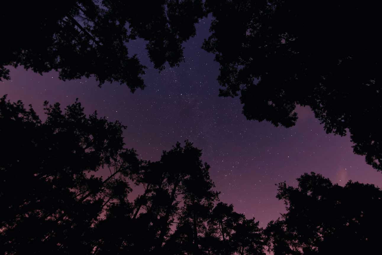
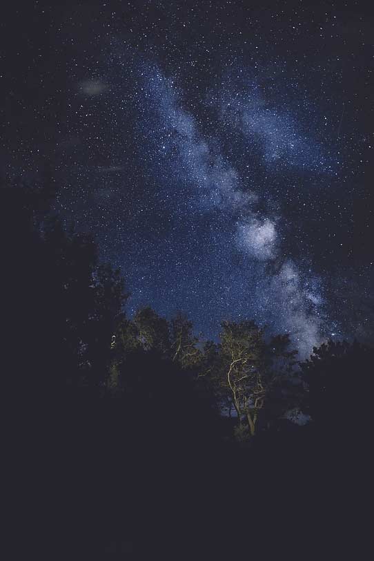
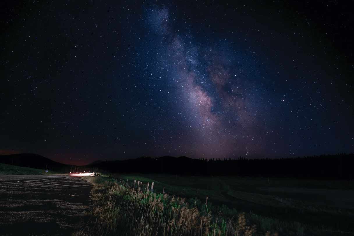
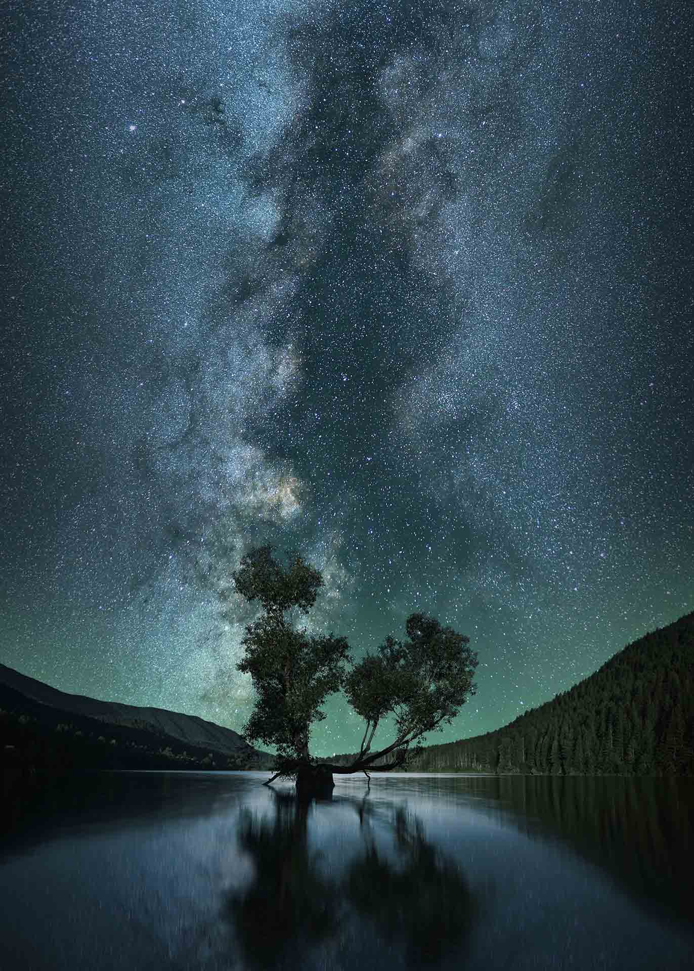
Pictures
High Quality Pictures
Choosing pictures that suited the magazine was probably the most fun part from it all. Pictures are really important because they catch the eye of the reader first and that is why it took me some time to find the perfect ones but at the end the results really left me satisfied.