An app I designed while working with Mercedes Benz Consulting & the mayor of Turin, Italy. We were supposed to come up with a solution for the “Smart City of Turin” project.
The proposal was an app for shared taxis which was going to reduce the pollution in the city & encouraging people to visit local landmarks.
Munich, DE
July, 2018
UI & UX
Aims & Goals
Goal of the Project
The starting goal was to design an app for shared taxis for people heading similar direction which is straightforward, intuitive & simple since the population of Turin, Italy is mostly elderly people.
Some helpful questions I asked myself before starting:
Q: What are the main challenges?
Let people know how many empty places are left in the cab, then find a way to motivate people to share the ride instead of booking a completely empty taxi. Lastly – simplifying the app as much as possible and making it suitable for elders.
Q: How to motivate people to use the app?
Offer them discount vouchers in exchange of shared taxi points for local cultural places such as museums, art galleries, exhibitions and even concerts happening in Turin.
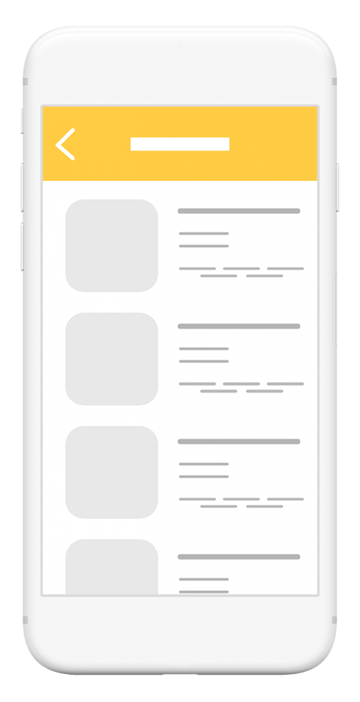
Wireframes
Structure & Wireframing
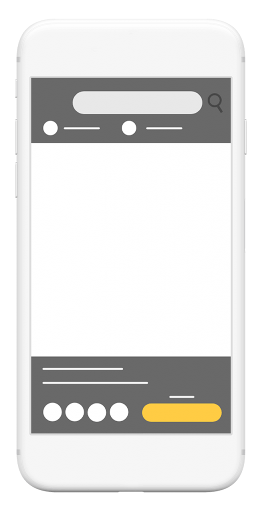
Before I started designing I quickly made a rough sketch of each page I had in my head. Of course in the process I decided to add some more pages and make it much more detailed but it is always good to lay down visually what is in your head first even if you develop new ideas throughout the process later.
Colors & Fonts
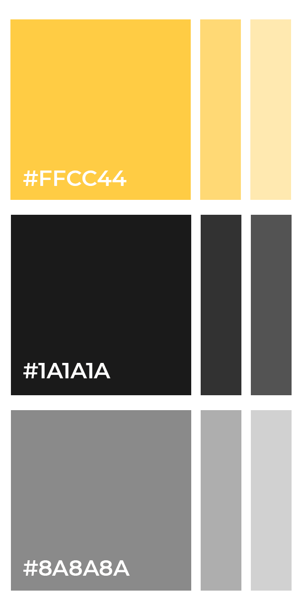
Color Palette & Font Choices
The color selection is pretty simple consisting of different shades of yellow, graphite black, grey and white. Typical taxi colors would not confuse the customers. Even the logo is simple and only uses a black taxi icon with a specific shade of yellow for the background.
One main font family was my choice for typography and it was SF Pro Display. I chose this simple font because of its simplicity and the variety of weights and styles that it has. It turned out looking minimalistic and simple just as I had hoped. It looks amazing on IOS devices.
Wireframes
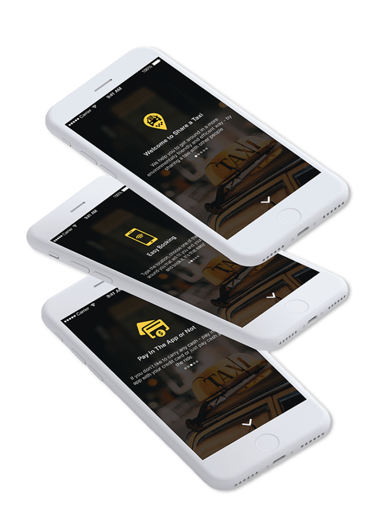
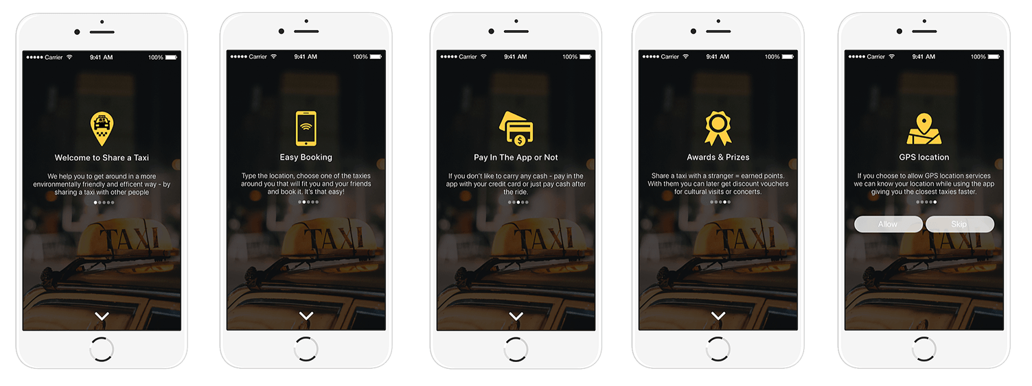
Inside of the App Tutorial
Most apps have a so called “Starting Screen” with which they briefly introduce the new user to the app and its most important features. I decided to include one because I thought it was important for the new users to know that if they choose to share a taxi they get points which can be exchanged for discount vouchers. Another pretty good reason is because of the elderly population that I mentioned.
Map & Key info
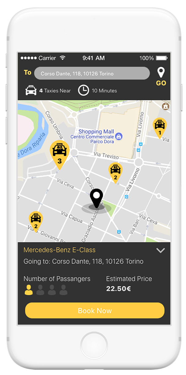
Map & Taxi Details
Once the user enters a destination they can see the map and the taxis around them that are heading a similar direction as the one they entered. Under the taxi icon they can see how many empty seats are left in the cab. Each taxi blob is clickable and displays more information about the taxi – destination of the passenger inside, car model, estimated price & a button for fast booking.
Destination
When the app is developed it is going to have an algorithm that will be responsible for matching as many passengers with cabs that are heading to a similar destination.
Number of Passengers & Price
The higher the number of passengers – the lower the prices for travel. Taking as many people at once is the whole point of the app and the idea to reduce pollution in Turin.
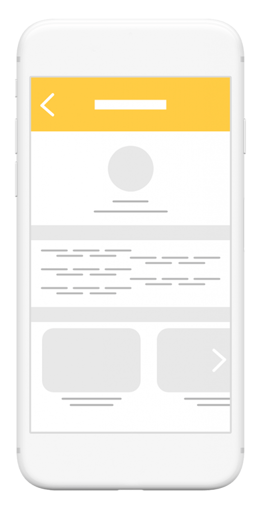
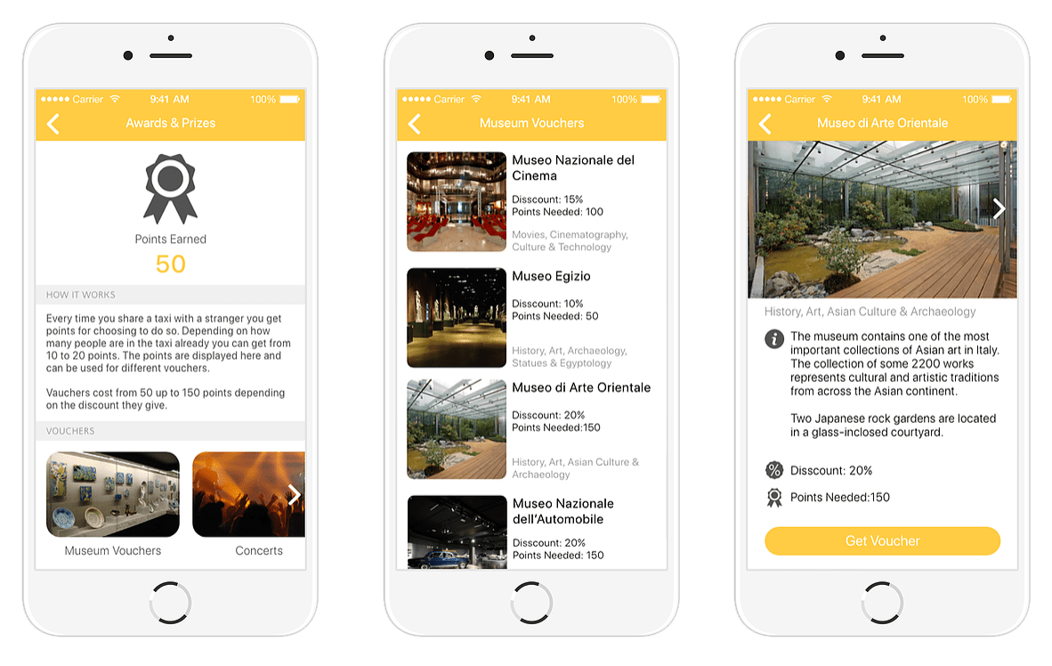
discount vouchers
Encouraging the Passengers
Users get points each time they share a ride with someone. Those points are displayed here and can be exchanged for discount vouchers for cultural landmarks in the city of Turin. Under the displayed points there is an explanation how the score system works. Below that are the possible categories user can choose from – museums, art galleries, exhibitions and local concerts.